ARCH1101 2015 Jacky Yuen
Thursday, 21 May 2015
Wednesday, 20 May 2015
General Feedback on EXP 3 progress work
- All need to pick up their pace. Please be reminded that the perspectives comes first before you start transforming these into an architectural solution.
- You are all one week behind already.
Wednesday, 6 May 2015
General feedback on this weeks progress
1. What are your geometries that are part of the ground and what are the ones that are part of the air (marker)? How do you moderate the transition and hierarchy between the ground and the air?
2. Details should not be arbitrary and avoid making your design appear additive, ie a design that is 10 blocks with a truckload of stuff thrown on top of it. Consider carving, materiality, tucking, adjacencies, joints as moments where you can insert some detail moments to.
You should also look back at the work of your two architects for inspiration on your details.
3. All of you should address the curvilinear intervention to some of your masses. Only half of the ones I've seen so far has.
You should also look back at the work of your two architects for inspiration on your details.
3. All of you should address the curvilinear intervention to some of your masses. Only half of the ones I've seen so far has.
4.GET A MOVE ON!
Tuesday, 28 April 2015
Experiment 2 - Some fundamentals
1) Draw, Model, Push/Pull, look, repeat - Start from the Moleskine (which constrains your drawings and gives them a sense of proportion), and push-pull-refine with sketchup (which has a limitless canvas and allows you to break beyond the boundaries). Work concurrently on both Sketchup and Lumion as shown in class so you can see your changes happening live.
2) Consider the interplay of various scales - balance of or otherwise
3) Architecture is about the experience both external and INTERNAL, or in this case, between the distant/grand and the personal scale. Please consider this point for this experiment:
01 - Lima Houses, Eduardo Souto de Moura
02 - Mario Botta, Chapel of Santa Maria Degli Angeli
03 - Tadao Ando, Rokko Housing:
04 - Tadao Ando, Chikatsu Museum
05 - Tadao Ando, Naoshima Museum
06 - Jun Aoki, Aomori Museum of Art: Idea of space as that between the landscape and the mass, rather than the massing.
2) Consider the interplay of various scales - balance of or otherwise
Example not with 10 blocks - keep yours to 10 blocks.
Exploration of various scales - ie what each block "could" become - is important!
4) Exercise some judicious thought into curvilinear forms. Curvilinearity can happen in different intensities rather than blindly hitting on the button within the artisan tool. Ask yourself "what are you trying to achieve by curving this element(s)":
4) This here is a good example of how to 1+1=3.
http://joshuasleight.blogspot.com.au/2014/04/combination-and-electroliquid.html
5) Details! What are your 10 blocks, what are details that goes beyond the 10 blocks, and how would you "skin" your blocks so that the presence of the mass is retained:
6) Landscapes + Forms. Make them work together:
Stolen from Ro's Blog - Thanks Ro!
Preston Scott Cohen - Torus House - Soft vs hard curves, vs straight lines. A planar surface is a curved surface with a radius of infinity.
With point 2 - strike the right notes between the balance (or juxtaposition) of curvilinearity and rectilinearity, ditto between large scale and small scale mass.
http://joshuasleight.blogspot.com.au/2014/04/combination-and-electroliquid.html
5) Details! What are your 10 blocks, what are details that goes beyond the 10 blocks, and how would you "skin" your blocks so that the presence of the mass is retained:
More importantly, learn when to restrain yourself and stop before the 10 blocks disappear.
01 - Lima Houses, Eduardo Souto de Moura
02 - Mario Botta, Chapel of Santa Maria Degli Angeli
03 - Tadao Ando, Rokko Housing:
04 - Tadao Ando, Chikatsu Museum
05 - Tadao Ando, Naoshima Museum
06 - Jun Aoki, Aomori Museum of Art: Idea of space as that between the landscape and the mass, rather than the massing.
Friday, 24 April 2015
1+1 = 3
As another way to look at what an 'electroliquid aggregation' is, think about it as 1+1 = 3 - the act of deconstructing two axos, two concepts, and two clients, then reblending them again into something completely new and almost barely indistinguishable from the two originals.
Daniel Libeskind's 1+1=3
My favourite ones are:
"...perceiving analogies and other relations between apparently incongruous ideas or forming unexpected, striking or ludicrous combinations of them" - Rem Koolhaas, Architect
"The unlike is joined together, and from differences results the most beautiful harmony." - Heraclitus , Philosopher
"...creativity seems to be something which links things together...within a new whole, which didn't exist before." - Rupert Sheldrake, Biochemist
The title of the book is 'The Art of Looking Sideways' by Alan Fletcher. Its either 600 pages of inspiring read and visuals on design, or a very useful doorstopper or brick depending on what your attention span is like.
Wednesday, 1 April 2015
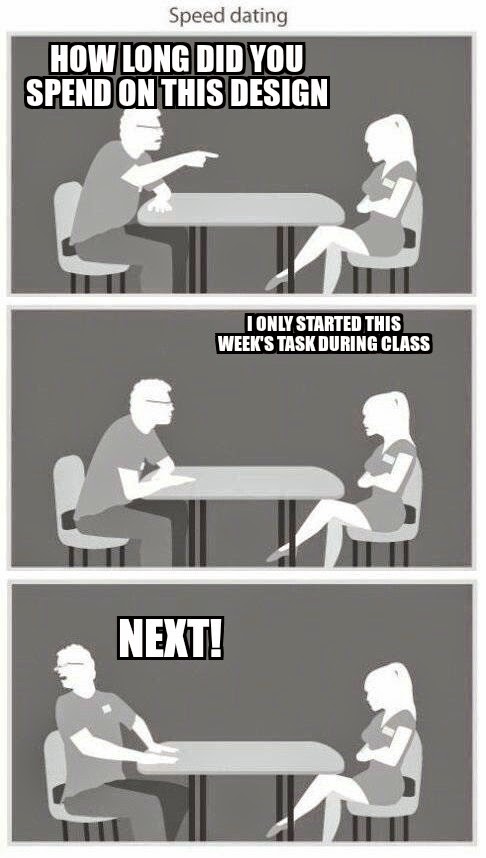
EXP 1 - Technical Feedback explained in Memes
1) Independent Tasks should be done BEFORE class, and definitely not DURING class - Most of the time, the results are poor, unarticulated design responses, and our feedbacks wont be helpful.
2) Design Holistically - Dont design in fragments, and never forget what youre meant to be designing.
3) Model Management - Layers, Groups, components will go a long way to make the file more editable.
4) Last minute never works in design - Design is a iterative process, and remember the minimum hours you're required to put into this every week.
High Res Site Image
Dropbox link to 25meg jpeg file https://www.dropbox.com/sh/cmxrhrazj58smtd/AACWK9xkH6wWFZ9h1JQl8ur2a?dl=0
Contour map viewer here
https://sdi.nsw.gov.au/nswsdi/viewer/index.jsp
Contour map viewer here
https://sdi.nsw.gov.au/nswsdi/viewer/index.jsp
Subscribe to:
Comments (Atom)


